Tanal KSA
– Brand Identity and Packaging for a Health-Focused Product Line
About Tanal KSA
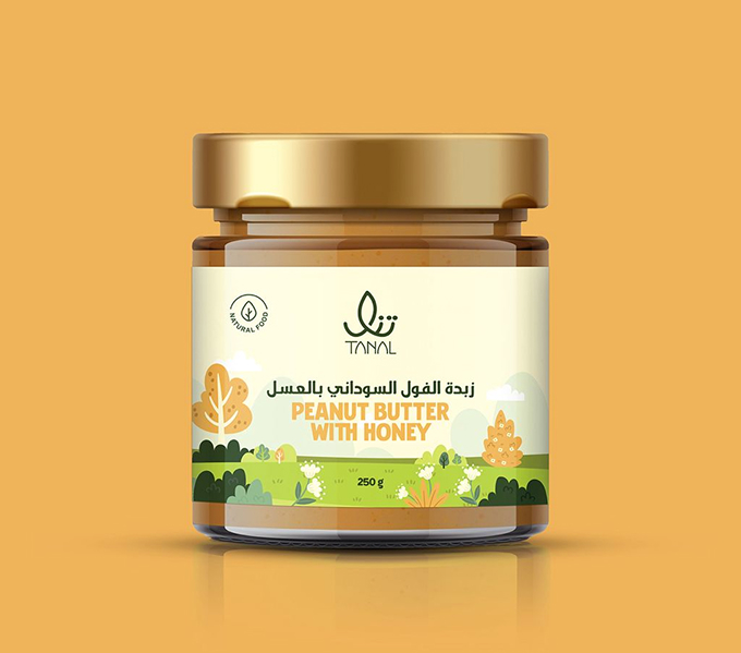
Tanal is a Saudi-based brand offering healthy alternatives for everyday nutrition, ranging from natural honey to nut butters like peanut and cashew. The brand focuses on clean ingredients, minimal processing, and a modern approach to healthy eating.
Key facts about Tanal KSA:
Offers a growing range of health-conscious food products
Needed a brand system that reflects quality, clarity, and wellness
Required packaging that stands out on shelves and communicates product benefits
Tanal brought us in to help define how the brand looks, feels, and presents itself across identity, packaging, and everyday touchpoints.
What We Delivered
Tanal brought us in to help define how the brand looks, feels, and presents itself across identity, packaging, and everyday touchpoints.
Brand Identity & Guidelines
We created Tanal’s full brand identity (logo, typography, color palette, and tone of voice) paired with usage guidelines to keep visuals consistent as the brand grows.
Product Packaging Design
We designed packaging for items like honey and nut butters, making sure each product clearly communicates its contents while staying true to the brand’s clean, modern aesthetic.
Labeling & Print-Ready Assets
We prepared final print files and layout systems that ensure quality across different packaging formats and product types.
The visual identity gave Tanal a cohesive look across product lines, helping the brand launch with confidence in a competitive retail space.
Build a Brand That Speaks on the Shelf
We create brand systems and packaging that help your products stand out, and stay consistent as you grow.